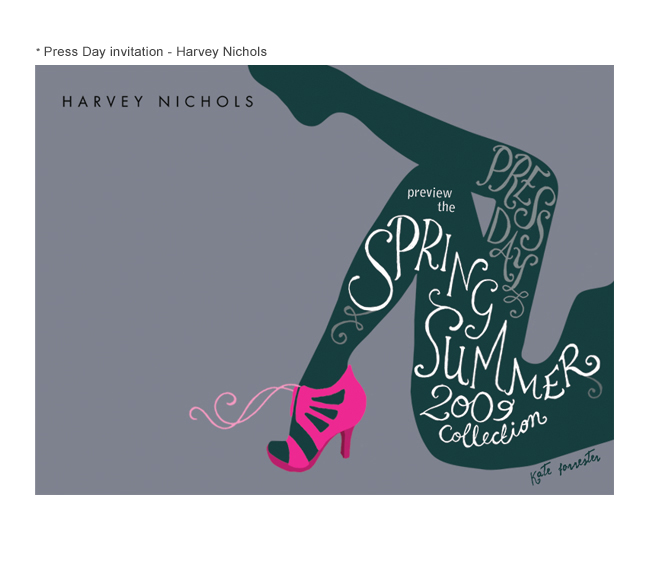
This is the work of Kate Forrester. One of my friends mentioned that I might like the work she does so I had a look and the First things I came across was her work For Harvey Nichols. The thing I like about Kate's work is that it is simple enough to be eye catching and get a message across to you straight away, but the drawing and the typography in her work is always really detailed and carefully drawn. I still haven't managed to find a perfect way to get my detailed drawing and mixing it with simple shapes to make an eye catching and interesting poster. The only criticism I have about her work is about her use of colour. Often she sticks to shades of the same colour but in her multicoloured images some of the colours don't seem to sit well with the rest of the image. Here is a small selection of her work...


No comments:
Post a Comment