Showing posts with label college. Show all posts

Thursday, 6 May 2010

BOUGHT A WEB ADDRESS :)

WWW.FOXESINCITIES.COM

There's nothing on it yet, but give me until my degree show and it will be up and running

Monday, 3 May 2010

MUSIC IS FREE

This is a few of my (soon to be) final pieces for my Music is Free major project. They are all based around free music and the idea of taking down the music empire. I'm not going to post all my work because it would take a million years, but here's a few:


MUSIC IS FREE

By the way, Music is Free doesn't have a website at the moment but if you want to know what they're about just go to their facebook at www.musicisfree.org (that address directs you to the facebook, im not an idiot).

Sunday, 2 May 2010

MUSIC LOGOS


I needed to design a logo for my Music is Free project so I did some research into existing logos from major record companies. Initially I wanted to design something that looked original, fun and anti-corporate to get across the ideas of Music is Free. After trying out a few ideas I came across an old Columbia records logo, see above. I decided to basically rip off this logo and redesign it to use for Music is Free. Music is Free is anti-corporate and about taking down the big music companies so I felt that using a stolen corporate logo would be ironic and also reinforce the ideas behind Music is Free. Below are the two final logos I am going to use on my posters.


AMPS


After looking at different types and models of guitar amps I produced a series of amp images for my major project. As the title of my project is 'music is free', I used all found materials, old card and paper etc to construct these images which has given them a really vintage and recycled appearance. I am thinking of using some of these amps on promotional postcards or business cards that I can hand out at my degree show to promote my work.

Tuesday, 20 April 2010

BUILDINGS

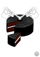
In my final project I am trying to show the music industry as a huge empire on its last legs. I have been to places like Lyme hall and Chatsworth to look at the architecture of the buildings and get some ideas for producing very regal, almost over the top buildings. Many of the buildings in Requiem for Detroit have inspired me aswell, especially the old factories. I have posted about that programme previously- it's well worth a watch. But anyway here are a couple of the buildings I have put together for my project.


Thursday, 1 April 2010

ADBUSTERS


https://www.adbusters.org/gallery/spoofads

Needing inspiration for my Music Is Free project and knowing I was working with the idea of 'taking down the music industry', I had a look into the work of adbusters.org. This organisation mocks corporations and products by producing funny and truthful adverts about them. For example, they produced a set of posters about Absolut vodka, imitating the brand styling and the advertising style. Instead of the typical vodka adverts showing people having a good time with alcohol and everything being fine, the adbuster campaign talked about the opposite effects of alcohol such as alcohol related deaths, impotence, addiction etc. Although these are serious issues, adbusters create their work in a light hearted and humerous way intending to make the companies seem stupid rather than just talking about serious issues. Other adverts they produced include a set of perfume and aftershave posters, one showing a fat, hairy man instead of models that show you 'the way you should look'.

Adbusters is about taking down the big companies and ridiculing them. They use corporate brands and styles, like the ones we see every day in magazines and on television, and interfere with them so they work against the companies. 

If I was studying for a graphic design degree I would probably be interested in the compostion and the overall look of the adbusters camplaigns but as an illustrator I am purely blogging about adbusters because it has given me ideas on how to use existing work against the company it is made to promote. The work they produce is clever and because they use material and imagery that people are already familiar with, it is easier for a wider audience to relate to the messages they are sending out.


Saturday, 27 March 2010

LAUREN MORIARTY


Lauren is a 3D/textiles designer who came to Stockport in March to talk to us about her work. She studied for a degree in textiles in Loughborough and now she designs products such as lamps (see below) and cushions which she has been able to sell to stores like habitat and various independent design stores. Her degree show at Loughborough was based around her study of textiles where she created 3D pieces that were made up of layers and layers of lazer cut vinyl. After exhibiting this work she got a lot of interest in her idea although it didnt have an actual use. Renault bought her design an used it as a parcel shel in one of their concept cars, and Lauren went on to make the structures into cushions which she hand made one by one and sold off.
Laurens work is often simple looking, but with a great deal of though behind it. Many of her designs are initially built up of simple, sometimes repeated patterns which as a whole make a really interesting piece of work.
After her degree, Lauren started a Masters with the intention of learning how to use her work and push herself towards creating final products which she could manufacture and sell.
She spoke about how she likes working on collaborative pieces with other artists and designers as it is always a good way of coming up with new ideas, or making your own ideas that you previously thought wouldn't work, work.


Lauren spoke about the work she creates and told us to, overall, make sure that we do something we like. She spoke about how important it is to make sure we create things that we are happy with because in the past she has done things which she hated, and then felt guilty for hating her own work. She spoke about how sometimes she had to reproduce the same work over and over again and explained that this can be boring therefore you should make sure that you are making something that makes you happy because the last thing you want to do is get bored of your own work.
Lauren spoke about the industry and told us that it is important for us to ask ourselves questions about our own work such as: 'What is your work?', 'Why would people buy it?', 'What would they do with it?' etc. otherwise you can spend a long time creating something that could turn out to be useless in the real world.
She spoke from experience about the fact that working with companies and other people means you will have to compromise- a lot. She said that often you have to simplify and simplify your work down to fit in with what other people want. A project she undertook with Camden council to designs some lamps for a main street showed her that, when working with other people, the final design is never going to be exactly how you imagine it because of so many limitations and other peoples opinions and ideas.

Tips:
Lauren told us that it is important to build up a relationship with the press, to be quick, efficient and polite, and it will work in our favour. She told us that it was important to have decent images of our own work, and be organised so that if somebody shows an interest in you, you can send them work quickly and it makes you seem more reliable and professional
She also said that customer feedback is very important as these are 'your' customers and the people that will be buying your work.
She spoke about buying our own equipment, (photocopiers, vinyl cutters for example) as it saves a lot of hastle and you don't have to pay to use someone else's machinery. Also it gives you the opportunity to play and experiment, which, in an art related job is always necessary.

Thanks to Lauren for coming in and speaking to us, she has been an inspiration in the way that she has done everything for herself and works for herself creating what she wants to create.

Monday, 22 March 2010

LONDON: KEMISTRY GALLERY


Back from Landan town now, it was the first time I'd been and it was a lot better than I had expected to be honest and there was so much inspiration everywhere that it has made me want to move down there after I graduate. Anyway, we went to Kemistry gallery to see a Polish poster exhibition while we were down there which turned out to be one of my favourite places out of the ones that we visited. Polish illustration has a look that is instantly recognisable and distinctively un-English although I can't seem to work out why. Some of the pieces we saw were similar in style to that of psychadellic posters from the 60's and 70's ( by artists such as Milton Glaser, Bonnie Mclean and Wes Wilson), but still had something about them that made them stand out and still be original.


The thing that impressed me most about these polish designers is not the fact that they are fantastic drawers or amazing artists, but the way they can always take two images, such as the gun/trumpet above, and merge the two ideas seamlessly into one image. The simplicity of a lot of these posters was interesting as well and has made me realise that sometimes i unnecessarily overcomplicate my work. Finally, this is hard to explain as I cannot upload the photos of the images I am specifically talking about, but a lot of the colour palettes used by polish designers are strange as they very often use extremely bright colours whilst somehow managing to make them look subtle and keeping the posters from looking garish.


Tuesday, 9 March 2010

TED BAKER PROJECT AND COMPETITION BRIEF

This is some of my work from the Ted Baker competition brief I was set. The brief was to design a window display for the Ted Baker stores. It had to be interesting and eye catching and should in some way promote Ted Baker and their winter range. I went for a pure black and white theme to get across the feeling of winter and for my displays I made a lot of different 3D models that could be set up in any way to fit any size and shape of window display. The models were different on each side so as you walk past you would see different parts and as you walked past one model it would reveal bits of others and I thought this would be more interesting than just having mannequins or an installation piece. I like the way I drew all the designs and they look good when they are at a bigger scale. Another thing I like about my idea is that it can be flat packed so it is easy and cheap to transport and send to the stores, it is all card and paper so it is environmentally friendly, and it would make the Ted Baker store stand out and seem fun.
Here are some of the final images and mock ups of the window displays:


Sunday, 14 February 2010

ANDY MARTIN

We had the privilege of having Andy Martin in college recently. He came in to talk about his work and stayed to work with us on a short brief for the Beaufort windscale calender. Andy talked to us about self publication and how important it was. He showed us some of the work he does outside his briefs and editorials to publicize himself and his work and told us that we need to start doing this kind of thing straight away if we ever want people to know who we are.
He spoke for a bit about working as a freelance illustrator with an agent and when I asked if it was worth having an agent he said that, for him, he would make about the same either way so it is just whether you want to put in that extra bit of effort yourself to get work or whether you just want to concentrate on the art and have the jobs come to you.
He also told us that it is often the simplest of things that are the hardest to do. Taking a photo of a dog for example, because a lot of people wouldn't want you taking a photo of their pet.

Andy was a great help when it came to working on the calender brief. I had the challenge of producing an image for January with no wind and you wouldn't believe how hard it is to show no wind. Andy was god though and he showed me how he would brainstorm and come up with lots and lots of ideas and then move them on into the image stage. My final piece came out well with his help.

What I gathered from Andy's visit is that being an illustrator can be hard work, it can be stressful and frustrating sometimes because you are always aware that you do not have a definite fixed income but at the end of the day you are doing something you enjoy so enjoy it.

Andy has done well for himself and although I personally find his work a bit basic and too 'clip art' for me, I understand his processes and why he chooses to work this way. Plus especially in the work he does, editorials mainly with a quick turn around time, simple images are often the punchiest and the fastest to produce. So although I wouldn't have his work on my walls, that doesn't mean I don't respect what he does.

Sunday, 6 December 2009

CONTAINER PLUS


Unfortunately I was ill when we had a lecture given by Container Plus so I couldn't make it into college. I did however spend a couple of hours staring at their website and I'm glad I did because I had only heard of Container Plus before and I had never seen any of their work. I love it a little bit. I really like the way they build everything for real, it's not just all digital like a lot of illustration and design these days. Their work is just interesting and lovely to look at. Looking through photos of their studio has also made me want to work in a similar kind of environment. I don't think I am the kind of person who could work from home alone and I don't think I want to be either. I really want to work in a collaboration or in a group because I feel, aside from the fact it would be a lot more fun, the fact there was more than one of you working on the same thing you would be able to come up with ideas together and help each other produce better work. Conatiner Plus produce different kinds of art including illustration, installations, 2D and 3D work. A thing that I like about Container plus is that, like me, they don't just have one style of working. What I gathered from talking to people about the lecture is that Container Plus likes to change their style quite often, mainly because if you have a good style, people will copy you. Constantly changing is a way to stay ahead of everyone, then, even if people start copying your style, you have already moved on to something else so it doesn't affect you and you do not get associated with the the companies/ individuals who are producing the same work as you.


Monday, 4 May 2009

FLIGHT PROJECT


When I started this project I had no real idea what direction it was going to go in so I began by building up research on planes, aircraft and birds. After collecting, photographing and drawing I came up with the idea of basically taking 'flight' and removing the flight from it. For example, the photos below show some of my work after I had photographed planes, extracted information and reproduced that information to create new images which no longer visibly resembled anything to do with flight.


These next images show me taking my work completely out of context. I used the images I had made by extracting aeroplane information and photographed them in scenarios that had nothing to do with flight,  removing almost all obvious meaning from my work. The photos below are my favourites out of the ones I took. I tried to take a leaf out of Charlie Whites book and produce photos that were bright and colourful and i used objects that looked odd and slightly out of place.


Sunday, 3 May 2009

UNDER THE BRIDGE


Here is some of my sketchbook work for the 6x6 brief. I had to do two illustrations for the short story "Under the bridge". This story was about a boy living in a poor scruffy neighbourhood who had been kicked out of his house and had to spend the night fending for himself. The story is gloomy and unfriendly and I wanted to get this across in my work. I used a lot of greys and muted colours in my sketchbook to echo the cold and unfeeling world in the story. The 'brid
ge' in the story is the one place where the boy was safe, and the only place he could stay. This became a focal point in my illustration as it was one of the most significant places in the story. I tried out many ways of drawing and representing the bridge, some more successful than others. I tried using the idea of a hand acting as a bridge to show the comfort and safety that it brought to the boy. A hand covering something shows protection and warmth and I used this idea in one of my final illustrations. The drawing with the rainbow is one of my favourite illustrations although I didn't use it for my final piece. I like the way the rainbow above the boy represents the bridge as being something warm and happy in an otherwise dark and unfeeling place. I used the blood on the boys face to give the impression that the story is a bit dark otherwise the mood of the illustration might have been too happy. Even though I did not use this illustration for my final piece, I kept
 the idea of the rainbow which I did use. I wanted to make the main illustration bold and dark and I tried a few ways of showing the mood of the story rather than picking out and drawing images. I used a lot of paint, textures and dull colours to get cross the overall mood of the story.
My two final pieces are below: